
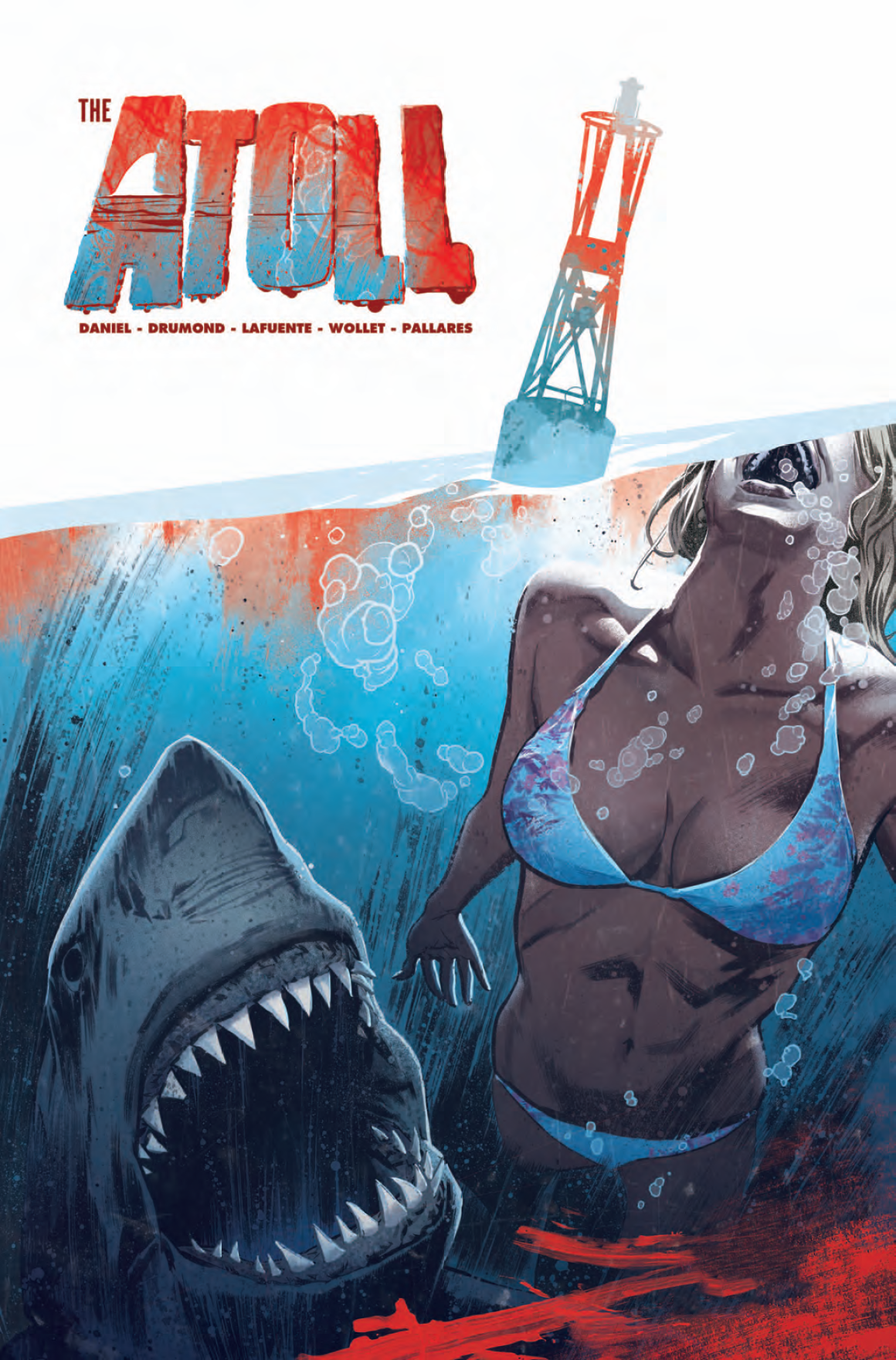
Review: The Atoll #1
I probably should have timed this review to line up with shark week, but since I don’t have cable and I’m not a college student or a child on summer break, I don’t actually care when shark week is. That and, internet. The Atoll as you can imagine from the cover and “shark week” mention, is about a shark. But not exactly.
I’ve been actually sitting on this review for a while. Not because it’s bad, quite the opposite actually. It has some problems with exposition, as in the exposition is thick and abundant. It’s forgivable though because of the concept. Which is what I’ve been struggling with. You see… I didn’t know what the premise was. I had a guess by the first page, but you don’t have that advantage and I don’t want to take it from you. Simply put, telling you what it’s about takes half the joy of reading it away from you.
 I will say that the premise has a very James Bond villain feel to it and reminded me of Balkans Arena in to a very slight extent. Out two main characters are celebrities of sorts, one being a former Olympic athlete and the other a billionaire software developer. That adds a degree of intrigue to how things will play out in the future issues.
Twitter is incorporated into the story. I found this part to be the most unrewarding because it didn’t add to the story and seemed like writer Tim Daniel was instead making commentary on how we digest news in the modern era. Which is fine but really has nothing to do with the rest of the plot, at least for now. That and the lettering on the tweets was small and hard to read against the rest of the book. I eventually stopped reading them and didn’t particularly notice when they went away, I was just glad that they did.
The art really got my attention. I can’t recall seeing Ricardo Drumond’s artwork before, but I definitely appreciated it here. He’s able to capture aquatic life realistically while still producing detailed visuals for humans as well. There was only a single panel that looked awkward, but it was forgivable as well. Joana Lafuente’s coloring gives the book a grainy grindhouse vibe. There’s expect specs of dust all over the artwork giving it personality and distinction.
I know that I haven’t told you shit about this book, but I really do hope you’ll check it out. There’s some stumbles for sure, not everything is perfect, but it’s probably the best version of itself it can be. That said, I had a lot of fun reading this first issue and can’t wait to read the rest of the series and that’s exactly what a first issue should do.
[su_box title="Score: 4/5" style="glass" box_color="#8955ab" radius="6"]
[/su_box]